
To better relax, reduce stress or just enjoy yourself on your spa day, it’s important to understand the psychology of color. The psychology of color has been studied extensively. The next time you go to the store and pick out a box of cereal, know that the colors on that box have been researched. The goal of that research is to help you “choose” that box of cereal over a competing brand. The colors selected are based on the emotional effect the colors are likely to have on the typical consumer.
What does color really do?
Extensive psychology of color databases contain information on your preferences as part of a group. They look at your gender, age, economic status and where you live. So, why is so much data gathered? The reason is because your emotional reaction to a color determines to some extent your behavior.
Who besides marketers is interested in the psychology of color?
The hospitality industry is very interested. Why? If you have a pleasant experience while visiting, you will be likely to return. Hospitals, doctor’s offices are also interested in the psychology of color. Studies have shown that some colors have a calming effect on patients. In children’s hospitals, bright colors are more pleasing to patients. Spas also are also interested in the psychology of color for two reasons. One, like that beautiful five star hotel, they want you to return. Two, spas are feel good places designed to enhance your health and well being. Therefore, color is a factor in the total spa experience.
What colors do luxury spas use?
I checked out a number of world famous spas. These included the famous Centre Biotonus Clinique Bon Port in Switzerland, Cal-a-Vie Spa in
California, Canyon Ranch in the Berkshires, Spa Cenvaree at CentralWorld, Bangkok, Thailand and numerous others. One characteristic of all those I looked at was their lack of bright vivid colors except as an accent. Some used soft pastels and others used deep intense colors in their décor, but all used colors designed to invoke a peaceful mind.
What to take home with this information.
When you are setting up a space for your spa day, take the colors in your surroundings into consideration. Instead of using the brightly colored recreation room designed for the kids, consider another room. If this isn’t possible, pull the shades and light the area with lamps or candles to mute the colors. The goal is to create a restful, relaxing, self indulgent environment. In addition to a restful mind, whatever colors you use, should also help to make you feel good.
Spas generally use colors that are designed to be restful and emotionally neutral. However that is not have to be the case when you are preparing a room for your personal spa day. Be aware of your own psychology of color. What I mean is for you to make a self study of your emotional response to various colors. For instance, does blue make you feel rested or does it depress you. How about red? Does it make you feel powerful or does it invoke feelings of excitement? Do you think of a rose or a fiery hell? Pay attention to those colors that make you feel rested, peaceful and beautiful. Where possible, those are the colors to use for your personal spa day.
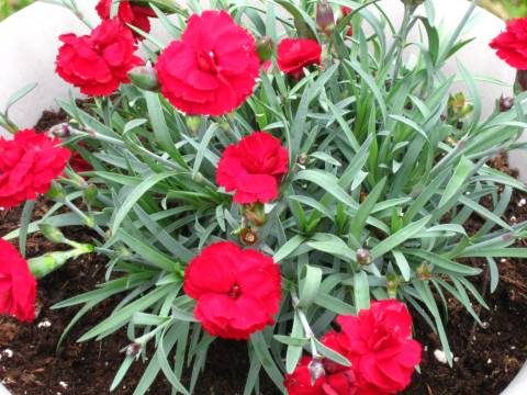
If you’re like me and enjoy bright vivid colors, do as the spa pros do and use them as accents. A small pillow or a vase of flowers will work nicely for that. The next time you go to the grocery store, pay close attention to the colors used on boxed and canned goods. Take it to the bank, someone else was thinking of you when they decided on the colors to use on their product(s).
Now go have fun and relax.